25 of the Best Google Fonts, Sorted By Popularity (w/ Font Pairing Tips)
[ad_1]
Choosing a font for your website is an important decision. After all, typography contributes to the aesthetic of your site and assists with readability. However, with so many options available, it can be challenging to select the right font for your brand.
Fortunately, the process can be easy when you know what to look for. Additionally, using a popular and legible font can help provide a better experience for your visitors, which may in turn boost your conversions.
In this post, we’ll explore 25 of the best Google Fonts, sorted by popularity. Then, we’ll share tips on how to create perfect font pairings and discuss best practices for using web fonts in WordPress. Let’s get started!
The Best 25 Google Fonts for Your Website
Are you looking for new fonts for your site? Here are some of the most popular Google Fonts to help you select the ideal typeface for your content.
5 Best Serif Fonts
Serif fonts feature tiny strokes (or “serifs”) at the ends of each letter. These typefaces have a very classic look and exude a sense of authority and tradition. They can convey trustworthiness and reliability, which makes them ideal for newspapers, magazines, and serious business sites.
Let’s look at some of the best fonts in this category.
1. Roboto Slab
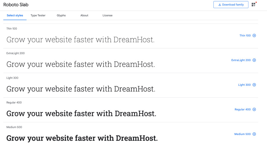
Roboto Slab contains open curves that allow letters to fill as much space as they need. It can provide a smooth reading experience and pairs well with many sans serif fonts, like Lato and Open Sans.
2. Merriweather
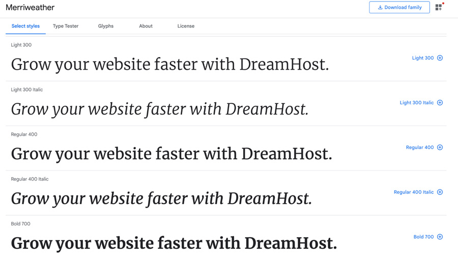
Merriweather was designed to be pleasant to read on screens. It features a very large x-height and mild diagonal stress. With its traditional look, Merriweather is an ideal option for literary publications and news sites. Plus, you can combine it nicely with Merriweather Sans.
3. Playfair Display
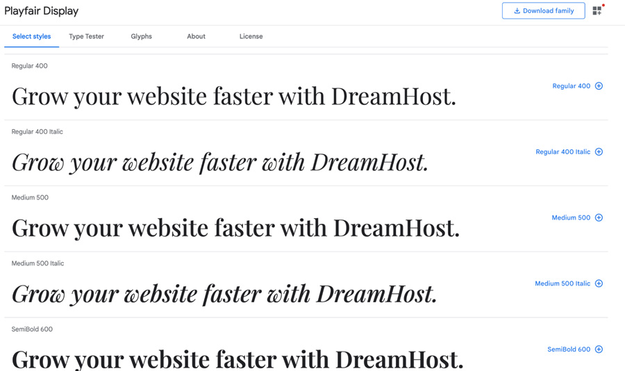
Influenced by 18th-century designs, this typeface lends itself to that period. It conveys a strong sense of authority, and its bold letters can make your text stand out. This font pairs well with Georgia or its sibling, Playfair Display SC.
4. Lora
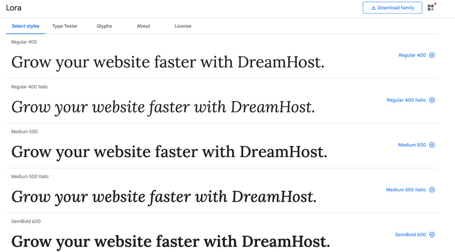
Lora is a contemporary, well-balanced serif font with roots in calligraphy. With its brushed curves and rounded serifs, Lora achieves a unique appearance with moderate contrast. This makes it an excellent choice for headings as well as body text.
5. PT Serif
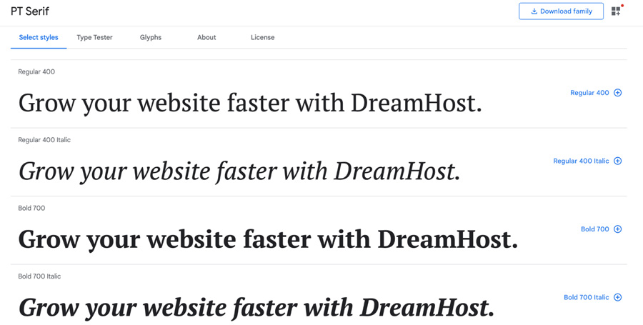
PT Serif was developed for the “Public Types of the Russian Federation”. The letters appear a little elongated, and they’re also bold and crisp. As a transitional serif typeface with humanistic terminals, it’s a great match for PT Sans.
Get Content Delivered Straight to Your Inbox
Subscribe to our blog and receive great content just like this delivered straight to your inbox.
5 Best Sans Serif Fonts
Sans serif fonts are often considered more modern and informal in comparison to serif typefaces. Since they have clean letters with no strokes, they’re much easier to read on screens. As such, they’re often used in blogs.
1. Roboto
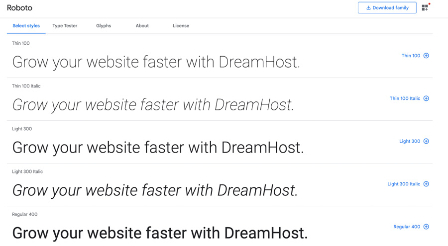
Roboto comes in twelve different styles, all of which are very popular. The sans serif font has a geometric form, which is nicely balanced out by soft open curves.
2. Open Sans
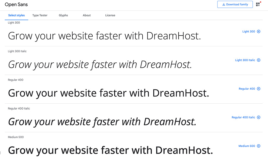
As a humanist sans serif typeface, Open Sans was designed with an upright stress, open forms, and a neutral appearance. This makes it a great choice for print, web, and mobile interfaces due to the superior legibility of its letterforms.
3. Lato
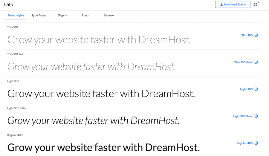
Lato was originally created as a set of corporate fonts. It has a crisp, sleek appearance. However, its classical proportions lend a feeling of harmony and elegance to the typeface. The letters create a sense of warmth, with a touch of seriousness.
4. Montserrat
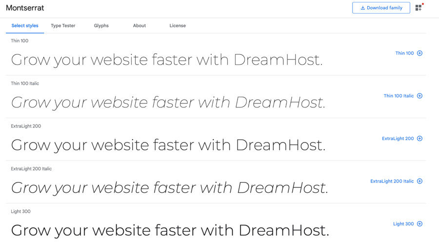
Montserrat was inspired by the old posters and signs in Buenos Aires. Therefore, it reflects the beauty of urban typography. However, it’s been made lighter, which makes it more appropriate for longer texts.
5. Poppins
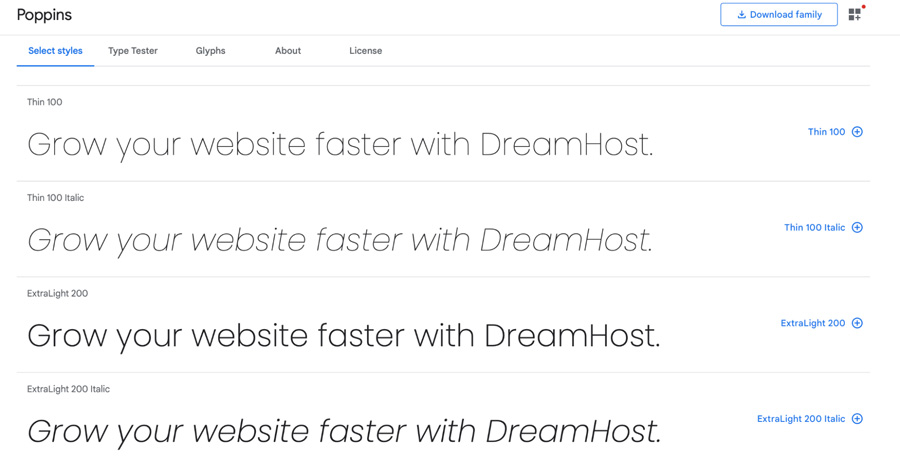
One of the newer sans serif typefaces, Poppins is largely based on geometry. It’s a versatile typeface with 18 styles in a variety of weights.
5 Best Display Fonts
Display typefaces are designed for large text, like titles and headings. This means they’re often used to entice readers or to evoke a certain feeling. Since their primary goal is to captivate audiences, they tend to have strong personalities and unique shapes.
Here are the most popular fonts in this category.
1. Bebas Neue
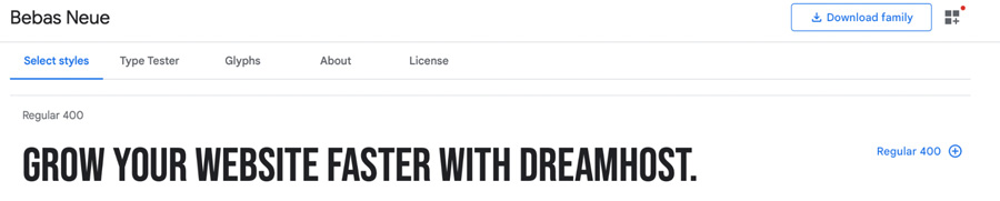
Bebas Neue is a great option for headlines. It has clean lines and elegant shapes. Due to its extended character set and OpenType features, the family is particularly suited to pro users. Plus, it pairs well with serif and sans serif fonts like Montserrat and Playfair Display.
2. Lobster
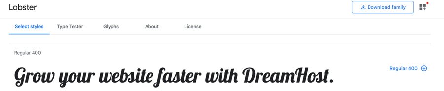
Lobster allows for the possibility to have multiple versions of each letter. This is a unique feature that enables you to select the best character depending on the context. Better yet, it happens automatically in any browser that supports ligatures.
3. Comfortaa
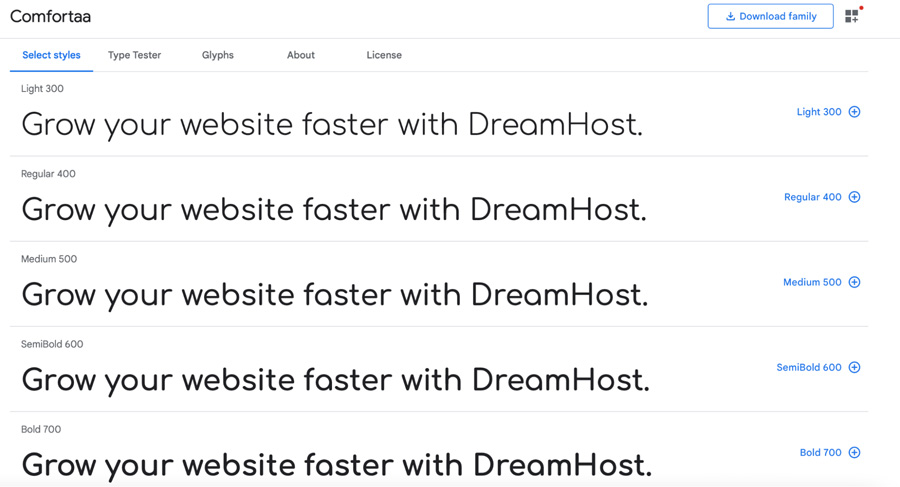
Comfortaa is a rounded geometric sans-serif typeface intended for large sizes. It’s a font that works great for both personal and commercial use. Also, the artist encourages feedback to enable continual improvement, so expect regular updates.
4. Abril Fatface
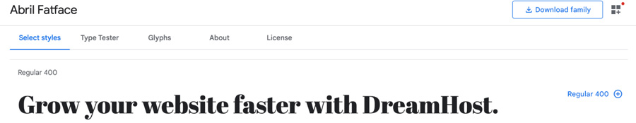
This typeface is inspired by the heavy titling fonts used in advertising posters in 19th-century Britain and France. Its clean curves and high contrast can help you attract your readers’ attention.
5. Alfa Slab One
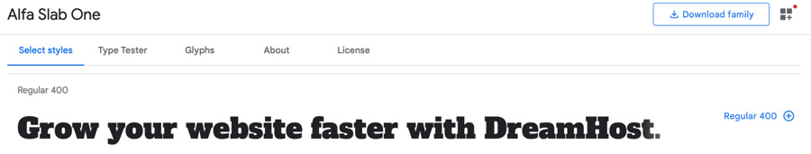
With a stylish, contemporary look, Alfa Slab One exudes extreme black density. It’s an eye-grabbing font with thick and rounded characters.
5 Best Handwriting Fonts
Handwriting fonts were designed to match the unique appeal of human handwriting. Unlike other fonts on this list, cursive typefaces are far more personal, which makes them an excellent choice for adding warmth and character to your texts. They are best suited for titles and headings, and they’re very popular among graphic designers.
Let’s look at some of the best handwriting fonts.
1. Dancing Script
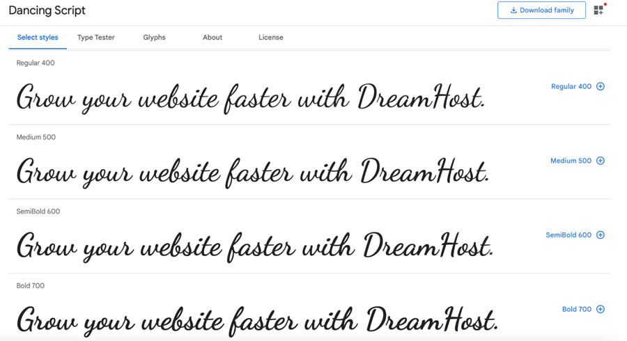
As the name suggests, Dancing Script is a lively, casual script where the letters bounce and change slightly. The caps are big and extend below the baseline, creating a friendly, spontaneous look.
2. Pacifico
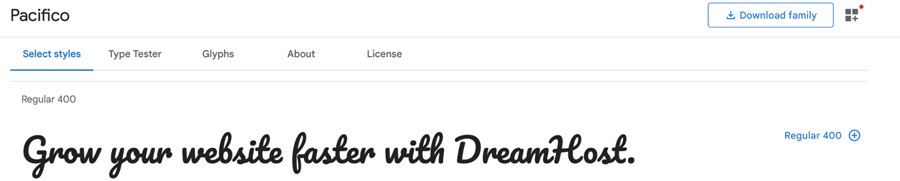
Pacifico is an original brush script handwriting font inspired by 1950s American surf culture. It was commissioned by Google and has undergone several iterations. It’s a fun font that can add personality to your content.
3. Shadows Into Light
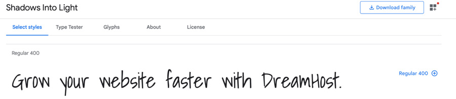
Shadow Into Light exudes a feminine feel with its nice rounded edges and curves. This makes it an ideal font for websites that target a female audience.
4. Indie Flower
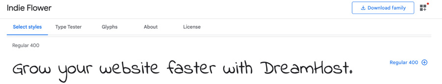
Carefree and open, Indie Flower has bubbly, rounded edges. Unlike some other handwriting fonts, it’s that little bit bolder, providing extra clarity for your readers.
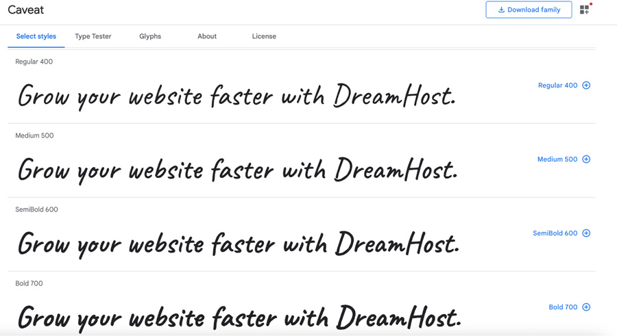
5. Caveat
Caveat was designed for short annotations and body text. Its OpenType features enable the letters to have slight variations according to their placement in a word. For example, a letter might appear more handwritten in some instances.
5 Best Monospace Fonts
Monospaced fonts are typically used by programmers due to their clean, simple designs, and constant spacing between characters. These font types make it easier to read code and format discrete columns.
1. Roboto Mono
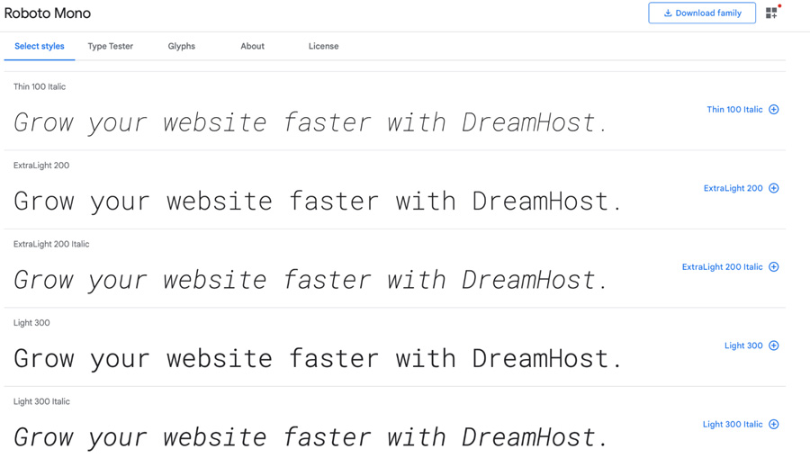
Roboto Mono is optimized for readability across many devices, which can help you increase conversions with typography. It’s an excellent choice for writing software source code due to the distinct, exaggerated appearances of letters and punctuation.
2. Inconsolata
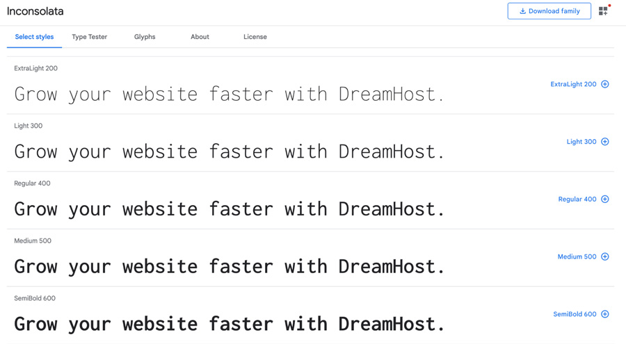
Inconsolata was designed for printed code listings and inspired by a lack of “programmer fonts”. As such, this is a brilliant typeface if you want to achieve attention to detail for high-resolution rendering.
3. Source Code Pro
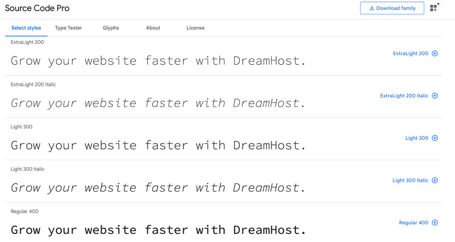
Source Code Pro carries the same vertical proportions as Source Sans. However, the letters are a bit spaced out. This makes it ideal for coding environments.
4. IBM Plex Mono
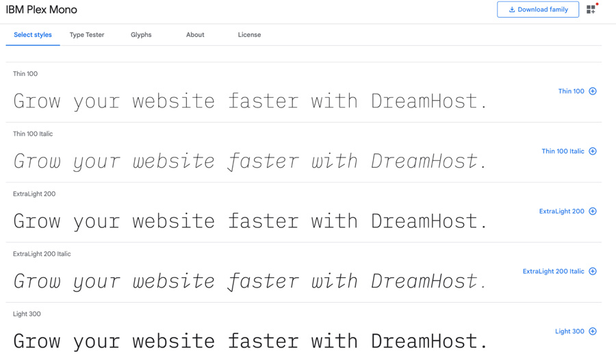
IBM Plex Mono boasts excellent legibility in print, web, and mobile interfaces. With a neutral, yet friendly Grotesque-style typeface, this font is great for showing code snippets. Plus, it works well with the Plex Sans and Serif.
5. Space Mono
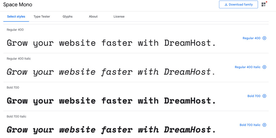
Developed for editorial use in headline and display typography, Space Mono’s letterforms infuse a geometric foundation and grotesque details. The font features many qualities often found in headline typefaces of the 1960s.
How to Create the Perfect Font Pairings for Your Site
Before you get started with font pairing, you might want to consider whether you actually need a secondary typeface. We recommend that you only use an additional font if it enables you to achieve a particular effect on your site.
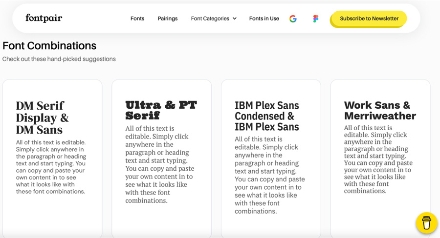
You can use a tool such as Font Pair to get ideas for combinations:
Also, the Google Fonts website provides some tips for pairing typefaces. For example, it offers advice for pairing fonts within families and pairing fonts by the same type designer such as Epilogue and Anybody.
You might use a secondary font to inject some personality into your website, especially if your main typeface is serious or formal. By pairing it with a friendlier font, you can make your brand more approachable:

You might also choose to utilize additional weights, widths, and styles when you don’t have enough variation in your initial typeface. In this instance, you might opt for a heavier typeface in order to distinguish important features, like headings, from the rest of your text.
Best Practices for Using Google Fonts on WordPress
Google Fonts is a library of over 1,400 open source and free fonts, so you’re spoilt for choice when it comes to choosing a typeface for your site. Let’s look at some tips for selecting high-quality fonts.
1. Minimize Page Load Delays
To create a well-designed website, it’s important to consider your User Experience (UX), Search Engine Optimization (SEO), and Core Web Vitals. These factors can help you maintain a steady stream of traffic, giving you a higher chance of converting visitors into customers. Fast loading times play a large part in your site’s performance.
Some fonts come with several different weights. While this demonstrates versatility and provides a range of options, loading all of these styles on WordPress can slow down your site. Therefore, we recommend a maximum of three weights.
To select the styles you’d like to use without downloading the entire font family, visit the dedicated font page and click on the plus (+) sign next to your preferred styles:
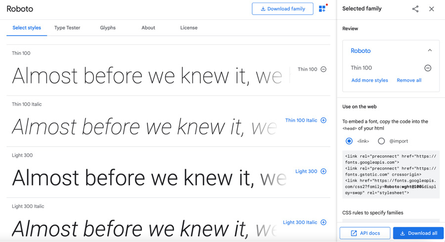
You might want to ensure that you have a regular, italic, and bold version of your font. When you’re ready, click on Download all.
2. Choose a Font that Updates Regularly
Over time, fonts may receive several improvements. You can find out how often a font is updated by selecting the About tab:
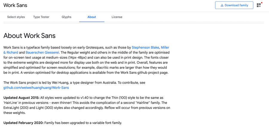
Using an old or outdated font can have a negative impact on your site’s performance. The typefaces in our list are some of the most popular ones, so it’s likely that they’re updated on a regular basis.
3. Make Sure Your Content is Accessible
Your chosen fonts should help make your site more accessible. For instance, you’ll want to make sure that users with visual impairments are able to read your content.
You can alter the size and color of your font to make it clearer. While doing so, it’s important to follow the Web Content Accessibility Guidelines to ensure that your content can be easily accessed by all users. Additionally, you can use tools like Color Contrast Checker to test the legibility of your text.
Optimize Your Site With Fonts
With so many fonts to choose from, it can be difficult to find the one that best suits your needs. Serif fonts like Merriweather and Lora are ideal for publications and business sites. Meanwhile, sans serif fonts like Open Sans can help you achieve a sleek, contemporary look.
Handwriting fonts like Shadows Into Light can inject a burst of personality into your content, while programmers can benefit from monospaced typefaces like Source Code Pro. You can also pair different fonts to make your site more visually interesting.
It’s easier to grow your website when you hand over the reins to a team of experts. At DreamHost, we can help you build a unique WordPress website to make your business stand out. Learn more about our web design services!
DreamHost Makes Web Design Easy
Our designers can create a gorgeous website from SCRATCH to perfectly match your brand and vision — all coded with WordPress so you can manage your content going forward.

[ad_2]
Source link