How to Wireframe a Website

[ad_1]
Making a website is easy.
Or, at least, it can be.
But when you start to create more complex websites, web apps, and even digital products, it can get more complex.
How do you go from an idea to a living, breathing website?
One key step in the process is to create a website wireframe. This strategic design tool helps your team align around key goals, plan complex web projects, and streamline your entire process for better results.
What Is A Wireframe?
A wireframe is a simplified version of a website, mobile app, or other designed product. It’s used as an aid during product design and development by providing direction and strategy to design teams and creatives who will produce the final product.
Wireframes generally distill complex design systems into simple elements, illustrating where and how different components should live within the final design.
A wireframe is like a UX blueprint for your website.
It maps out certain features of your site, such as menus, buttons, and layouts, while stripping away the visual design. This gives you an idea of your site’s underlying functionality and navigation without distracting elements such as its color scheme and content.
Rather than including specific images or design choices, the wireframe will instead focus on how different elements are placed in relation to each other and why the design is constructed in this specific way.
This also helps establish a clear information architecture or hierarchy for how specific features or information should be displayed and the underlying goals driving specific design decisions.
Wireframe
A wireframe is a two-dimensional illustration of a web page that determines where elements will be placed. This is an early step in the design process that focuses on content spacing, functionalities, and intended behaviors.
Read More
Types Of Wireframes
While wireframes generally refer to an “outline” version of the final design, the exact way a wireframe comes together can be different for different needs.
Wireframe vs Mockup vs Prototype
Before we dive into the specifics, let’s first mention- while they’re related, wireframes are different from mockups and prototypes.
It’s not uncommon for companies to spend $10,000 or more on an initial website design. So getting the basics right before investing that money is critical. In many cases, the team will go through several stages of planning before they begin work on the actual product.
Wireframes are often the starting point of the design and development process.
Design teams might sit down around a whiteboard and sketch out how a page should look using basic shapes and text to illustrate how the different components fit together.
Mockups take the wireframe one step further by applying specific design choices to the skeleton of the product. They generally include colors, fonts, and images to bring the design closer to completion. Or they use placeholders for things like images and text (e.g., “Lorem ipsum”).
But a mockup is a static image rather than an interactive product.
It’s useful for understanding how the final product will look visually but doesn’t help you understand what it will feel like to use it directly or navigate the site map.
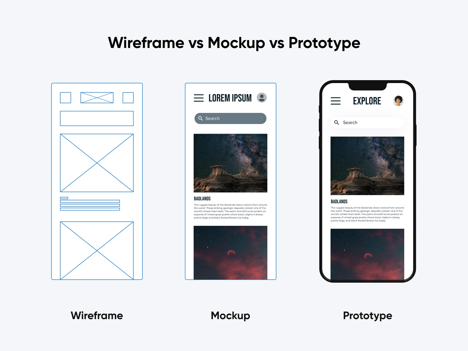
Prototypes are semi-functional versions of the final product that generally implement the planned design and some elements that allow you to test expected user behavior.
This is especially important for interaction design, UI design (user interface), and UX (user experience).
Creating a prototype is often essential for more complex design projects like developing a mobile app. Product managers can use prototypes to test actual functionality and get feedback from stakeholders, users, and customers.
Get Content Delivered Straight to Your Inbox
Subscribe to our blog and receive great content just like this delivered straight to your inbox.
High-Fidelity Wireframes vs Low-Fidelity Wireframes
Wireframes can take many forms.
The easiest way to think about them is a spectrum between “low fidelity” and “high fidelity”. In some cases, the design process may start with low-fidelity wireframes that are then revised to include more specifics and details.
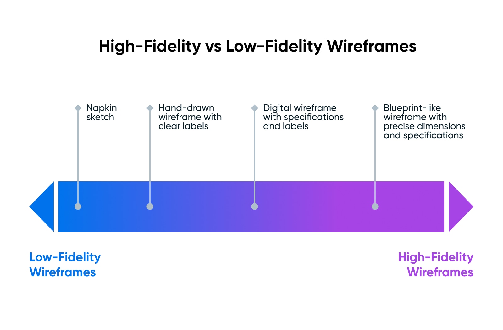
Low-fidelity wireframes may be as simple as a hand-drawn sketch on the back of a napkin, illustrating the basic layout and information architecture of a page or product.
High-fidelity wireframes could include extremely specific details, like exact specifications and pixel placement. It might end up looking more like a blueprint you’d use to build a house.
Why Create A Website Wireframe?
Designing and building things is expensive and complicated.
Wireframes serve a few incredibly important purposes:
User Experience (UX)
User Experience (UX) refers to how online visitors interact with a website. Users often evaluate their virtual experience based on a site’s usability and design, as well as their general impression of its content.
Read More
How To Use Wireframes
Once you have a wireframe, how should you use it?
Testing
The most important thing you should do with your wireframe is use it to test and learn.
Share the wireframe with your stakeholders, your users, and your grandma. Collect feedback and use that feedback for future iterations. Keep testing and tweaking until your expectations (e.g., where you want users to look or click) align with the feedback you receive.
Then you can move to the next step toward the final design.
Turn It Into A Mockup
Once you’ve gotten feedback and feel confident with the general layout of your wireframe, you can move forward to the next step.
Depending on what you’re building (simple website, complex web app, etc), one plausible step would be to hand off the wireframe to a designer and have them turn it into a mockup that better represents the final product with the appropriate colors, images, fonts, and more.
Turn It Into A Prototype
For interactive products and websites with complex user journeys or workflows, you’ll also want to use your initial wireframe to develop a working prototype.
Before moving into the actual development process, build an interactive version of your wireframe to further test and validate your design.
Depending on your exact use case, a UI kit like Bootstrap or (the aptly named) UI Kit can help you rapidly and easily turn a napkin sketch into a semi-functional website or app.
Key Components Of A Wireframe
What goes into a wireframe, and how do you make it useful and usable?
There’s no single language for wireframes, but the most common components mirror the real-world versions that will make it onto the website.
Keeping in mind that the wireframe doesn’t need any specifics or details, it should show the relative placement and flow of key features like:
- Headers
- Text boxes
- Images, videos, or icons
- Navigation
- Logos
- Search features
- Dropdowns
- Buttons
Any and all of these things are likely to be part of your final website or app, so it makes sense to start with them in the wireframe to ensure they are accounted for before moving into design.
How To Wireframe A Website (In 6 Steps)
Creating a wireframing process can become a time-consuming process. However, taking the time to iron out UX issues ahead of time will give your site a much better chance of success down the line.
The six steps listed below will help you get started:
Step 1: Gather The Tools For Wireframing
There are two main methods for creating wireframes: By hand or digitally. If you’re going with the former option, all you need is a pen and paper to get started. Some designers begin with a low-fidelity paper wireframe for brainstorming and then create a high-fidelity version later using digital wireframing tools.
Step 2: Do Your Target User And UX Design Research
Before you officially start drafting your wireframe, it’s helpful to do some research.
For starters, you’ll want to know who your target audience is, to help determine which features need to be most prominent on your site so that visitors can find what they need.
User personas can be a helpful design tool for this process. Try creating some for your potential user groups so you have a reference you can return to throughout the wireframe design process. Personas can also help create a marketing strategy later on, so hang on to them.
It’s also wise to research some UX design trends and best practices. This can provide insight into elements, such as menu layouts, the positioning of your logo and other significant branding elements, and content layouts. Users find it easier to navigate a website that follows conventions when it comes to these features.
Persona
In marketing, ‘persona’ refers to a fictional customer that reflects your primary audience (or one of them). Businesses develop personas to understand better who they’re marketing to and how to sell to them.
Read More
Step 3: Determine Your Optimal User Flows
A user flow refers to the path a visitor takes to complete a specific goal on your website. So, for example, if you have an e-commerce site, one user flow might be from a product page to the end of the checkout process.
Determining the key tasks users must complete on your site can help you create the most straightforward user flow for each potential goal. This will help maximize UX by making your website easy and enjoyable to use.
That said, it can be hard to get into the mind of a hypothetical user. Asking yourself these questions can help when you’re trying to work out your primary user flows:
- What problems do you intend to solve for users? What goals might they be hoping to achieve by coming to your site?
- How can you organize your content (such as buttons, links, and menus) to support those goals?
- What should users see first when they arrive on your site, which can help orient them and let them know they’re in the right place?
- What are the user expectations for a site like yours?
- What Call to Action (CTA) buttons will you provide, and where can you place them so users will notice?
Each of these answers will suggest something vital about the way you’ll need to design your pages.
Step 4: Start Drafting Your Wireframe
Now that you’ve gathered your tools and key information for your wireframe, you can start drafting. Keep in mind that the purpose of this task is not to create a complete design for your website. You’re focusing solely on UX and how you can create a page that is easy to navigate and understand.
To that end, your wireframe should include features and formats that are important to how your users will interact with and make use of your website. These might include:
- A layout noting where you’ll place any images, branding elements, written content, and video players
- Your navigation menu, including a list of each item it will include and the order in which they will appear
- Any links and buttons present on the page
- Footer content, such as your contact information and social media links
Your answers to the questions in the previous step will likely help with this stage of the process as well. Remember to consider web design conventions, user expectations, and information hierarchies when placing these elements on your page.
There are also several elements that aren’t appropriate for a wireframe.
Visual design features, such as your color scheme, typography, and decorative displays, should be left off your wireframe. In fact, it’s best to keep your wireframe in grayscale so that you can focus on usability.
You also don’t need to insert images, videos, written content, or actual brand elements, such as your logo and tagline. Placeholders for these features will get the job done. The idea is to avoid incorporating anything that could provide a distraction from user flows and navigation elements that are fundamental to UX.
Step 5: Perform Usability Testing To Try Out Your Design
Once your initial wireframe is completed, you’ll need to conduct some testing. This will help you determine if it has accomplished its goal of mapping out your site’s simplest and most natural user flows and UX.
After all, effective UX design focuses on getting your site’s key functionality just right. Without a design that supports a strong, positive UX, you run the risk of higher bounce rates and lower conversion rates.
Conversion
A website conversion is any action a user takes on a site that moves them further into the sales funnel. Examples include filling out a web form, clicking a call to action, or purchasing a product.
Read More
A wireframe will not only smooth out your creative process; it should improve usability in a way that you can measure and even quantify. This is how testing can help.
If you’re working with a team, your first round of testing will probably take place internally. Each team member should spend some time with the wireframe to see if it makes sense. Have everyone work independently so as not to influence one another, and take notes on any issues they run into.
However, there are also tools that can provide more objective usability testing for your wireframe. These tests are meant to imitate actual users, which can be particularly helpful. Just because your team of web designers finds your wireframe logical doesn’t mean that the average site user will.
UsabilityHub is a platform that connects designs with real users to give you feedback on how the average visitor perceives your wireframe.

It offers a free plan so that even small sites and non-designers can put this tool to good use. For professional designers and teams, there are also plans that provide advanced features to help with more extensive and in-depth testing.
Related: Top 6 Basic Elements Of Web Design
Step 6: Turn Your Wireframe Into A Mockup Or Prototype
After your wireframe has undergone testing and you’ve determined the best possible UX design for your site, it’s time to turn it into a mockup or prototype. Unlike wireframes, which are static, prototypes include some basic functionality so that you can test out user flows more realistically.
It’s helpful to choose a platform that can turn your wireframe into a prototype.
Prott, for instance, enables you to create interactive, high-fidelity prototypes from your wireframe.
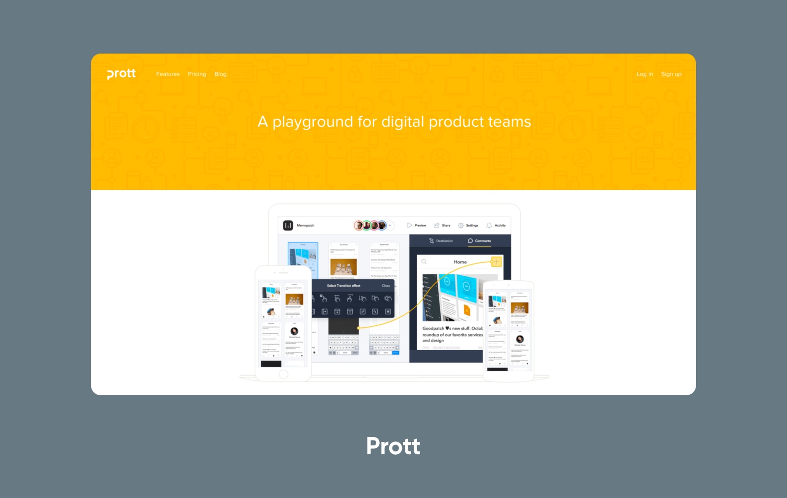
However, if you prefer, some platforms focus specifically on prototyping.
Whichever tool you choose, you’ll want to put your prototype through another round of user testing once it’s complete. After your prototype has passed, you can get to building your actual site with the confidence that your UX will be top-notch right from your launch date.
As far as digital wireframing options go, a wide variety of wireframe tools are available. Here are a few of our favorites:
#1: Wireframe.cc
If this is your first wireframe, or if you’re a single Do It Yourself (DIY) site owner and not a designer, you might try a free tool such as Wireframe.cc.
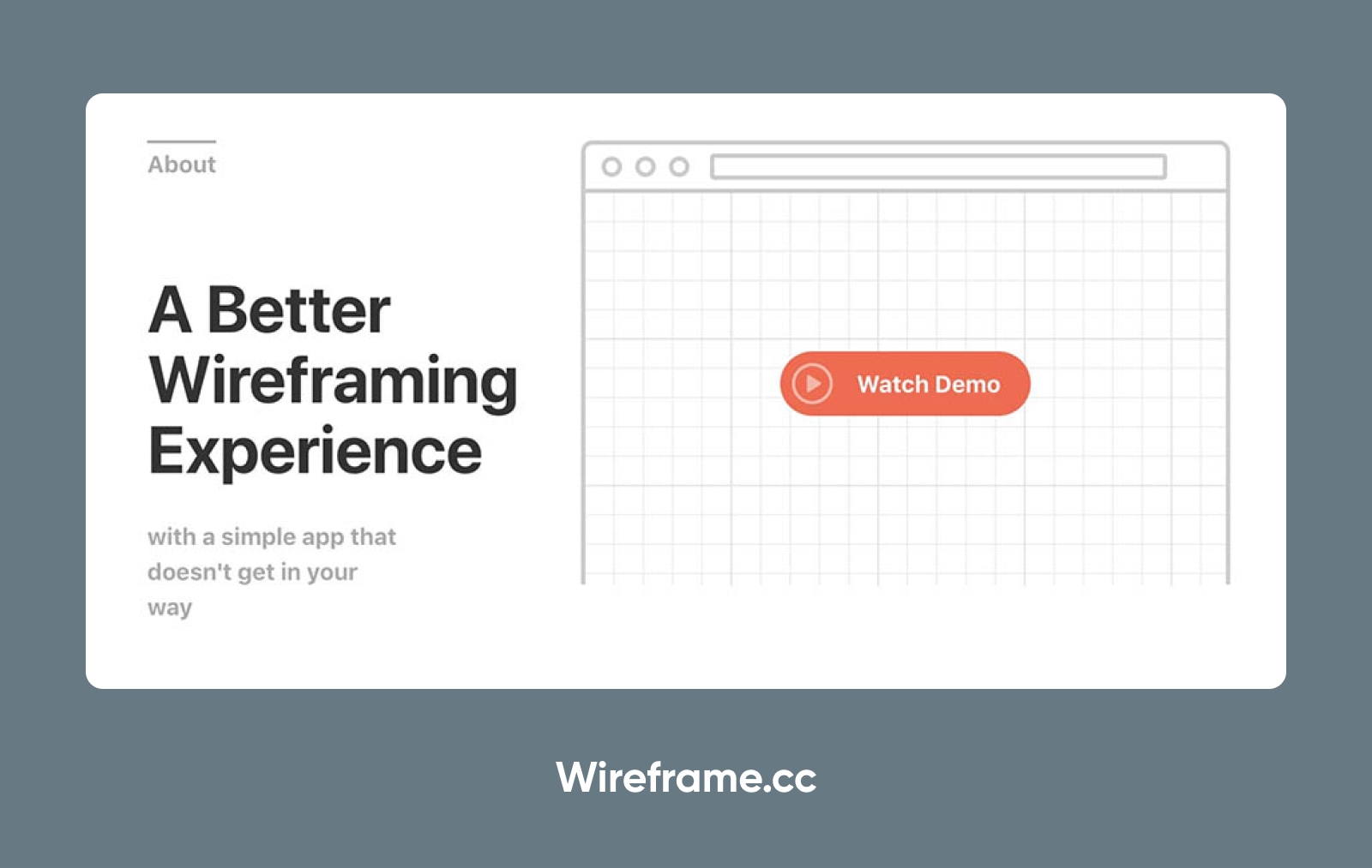
This simple wireframing tool keeps your drafts from becoming cluttered by limiting your color palette. You can create easy designs with its drag-and-drop interface and annotate your drafts so you don’t forget important information.
#2: Wirify
Another option is Wirify, a bookmarklet that you can add to your browser.
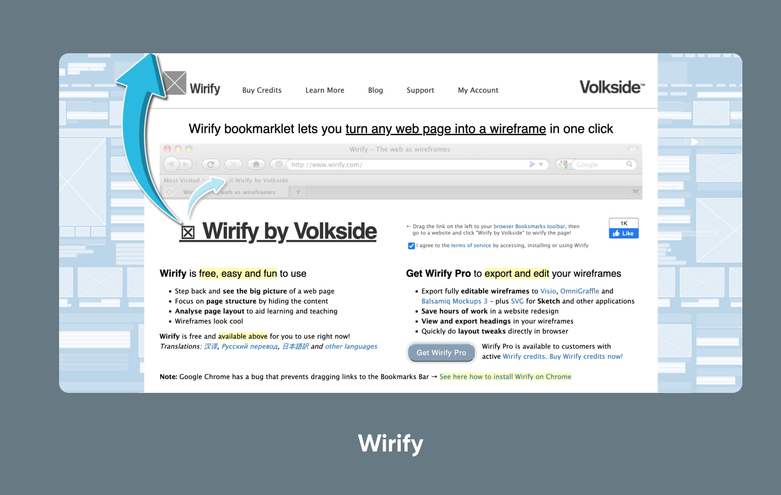
This tool’s interface turns existing web pages into wireframes. Rather than helping you draft UX design for a new site, it’s most helpful for website redesigns.
#3: Balsamiq
If you’re willing to spend a little money, on the other hand, you might look into Balsamiq mockups.
It boasts an easy-to-use, collaborative wireframing interface, great for teams and professionals who need real-time collaboration. However, it is limited to static wireframing.
#4: Prott
If you’d like a more comprehensive tool that can also be used for prototyping, you might try out Prott.
We mentioned before, but Prott makes it easy to wireframe and prototype with a single tool. And it offers a number of collaboration tools that allow your team to build custom UI kits, set design standards, and more.
#5: Figma
Another great comprehensive option is Figma.
Figma can work both to build simple wireframes, create mockups, and build interactive prototypes (among many other things!)
#6: Adobe
Adobe probably needs no introduction in a post like this, but we should definitely mention their suite of tools. Adobe XD (Experience Design) was built specifically for all kinds of product design work; it seems to now be rolled into Figma as part of their acquisition/merger.
But the Adobe CC suite offers a range of tools that could be used for wireframing, mockups, and prototyping.
Wireframe Examples
Looking for some inspiration? Here are some wireframe examples to give direction and vision for your own work.
Annotated Hand-drawn Wireframe Sketch
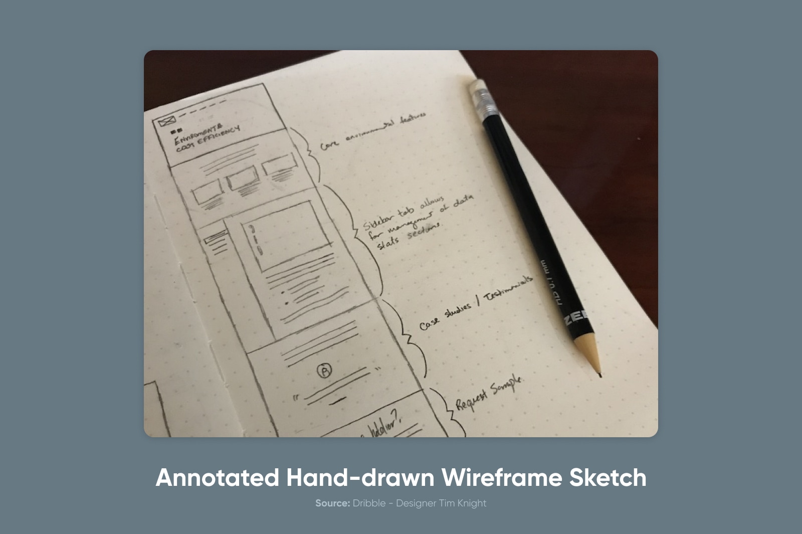
Designer Tim Knight shared this example of a sketched wireframe.
Low-Fidelity Digital Wireframe
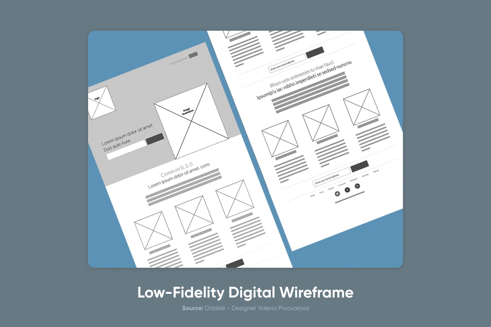
This example comes from designer Valeria Pivovarova.
High-Fidelity Digital ‘Wireflow’
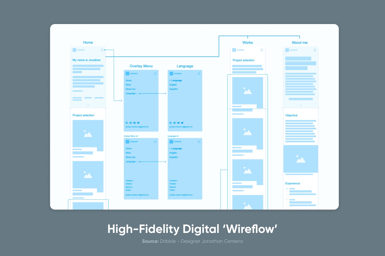
This example from Jonathan Centeno combines elements of a high-fidelity digital wireframe and a user flow map, laying out how users should move through the website.
High-Fidelity Digital Wireframe

Kira shares this high-fidelity wireframe that includes many specific design elements and even placeholder copy.
DreamHost Makes Web Design Easy
Our designers can create a gorgeous website from SCRATCH to perfectly match your brand and vision — all coded with WordPress so you can manage your content going forward.

[ad_2]
Source link
