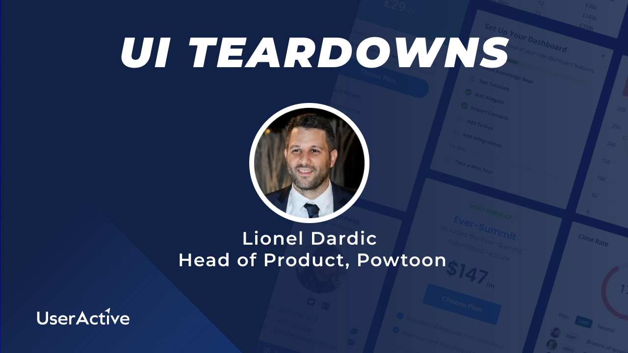
SaaS UI Teardown: Lionel Dardic, Powtoon
[ad_1]
During this live UI teardown Peter was joined by Lionel Dardic, Head of Product, as we review Powtoon‘s sign up and Freemium onboarding experience. Powtoon is a SaaS that enables users to create easy and fast videos, animations, and presentations for a wide variety of uses. With an ARR of $20M, Powtoon has an advanced set of features and functionality and a premium look and feel. We explored how to present a wide variety of functionality to new users without overwhelming them. We also reviewed how we can get users activated and help them understand the potential of the product!
[00:00:00] – Peter
Live with Lionel Dardic from Powtoon, Head of Product. Today we’re going to shoot a UI tear down of Powtoon. Lionel, thanks for joining us. Do you want to just introduce yourself and tell us a little bit about how to what it is and what it does?
[00:00:21] – Lionel
I’ll be glad to have some background notes here, but I will try. Yeah, sure. I’m in Baltimore for about a year leading the product team and I did various different product roles in the last ten years. Our tool is a visual communication platform that brings the solution to the pain point when people are doing long presentations and becomes boring. So we have a very cool tool that you can prepare videos and presentations very quick and very fun, very engaging videos by just drag and drop. You cannot with characters or cartoons, you cannot do it. Images, backgrounds and so on to prepare in minutes or in hours. A great video to communicate and to engage with your audience.
[00:01:33] – Peter
Okay, super stuff, thanks for joining me. I’m going to share my screen. I’m going to jump into Powtoon and we’re going to take a look at the product, sign up, process some of the features and see what our impression is of the product experience. Okay, so here’s Powtoon, and I’ve got the there’s a nice chat support widget there on the homepage create jaw dropping videos and presentations. So I’m going to go through this sign up process, start now, and then I’m going to just set up an account here. I think I’ll probably have to verify my email. Let’s have a look. Okay, so I’m just going to go and verify this email now and we’ll come back and sign into the product. Okay, so I’ve literally just signed up, I’ve gone to my email, I’ve verified my email, and the first thing that happens is I’m landing inside the product with a nice welcome screen. So it says, welcome home, Peter. We’ve got some personalization going here. Let’s begin with a few simple steps to personalise your experience so far. I think this is a really nice welcome. I can see in the background an interesting home screen or dashboard, so I’m looking forward to getting through this so that I can engage with the product.
[00:03:39] – Peter
The graphics are fresh and friendly and colourful, so feels light and modern. Okay, so let’s start. I want to make video and visual content for, I will say business and work whilst working for a small business. So I see these dropdowns, they pop up. I don’t need to select on a drop down or anything like that and I can just go through this and quickly and easily select the right quarter of the fifth. Now right here, it’s a little bit hard for me to read what I’m writing anymore now. So there’s something our business work while I’m in a small business as a team leader of A, and I’m going to say we’re a design agency, right? But I’m going to say product management because that’s the closest category that I can see here. Product management team. Okay, next. So that’s nicely personalised the experience here. I’m seeing a modal on top of a modal, which is interesting. I would wonder whether this could just be embedded straight in the original modal, but it says, make yourself at home. Take this quick tour to start creating amazing videos and visual content. Let’s go. Okay, I think that could have been done in the main mode, but never mind.
[00:05:03] – Peter
So never miss a beat on what’s new. Get tips and tricks, announcements and exclusive deals. You can always change your mind later. Okay, there’s a free gift. This is some templates for a free gift. I’m not going to claim let me just see what it says. If I select claim, gift claimed. Okay, that sounds nice. I see a slight distraction, and there’s an expiry timer here for the gift. So I wonder at the moment, I’m thinking, how long is my free trial? And the expiry here is based on the gift rather than on the free trial. So I’m not really sure how long my free trial is.
[00:06:05] – Lionel
Just to explain, you created a free account so it doesn’t expire.
[00:06:16] – Peter
Okay, we have a free trial, but.
[00:06:18] – Lionel
Here we have a free account that is forever. It doesn’t have an expiration.
[00:06:24] – Peter
Great. Okay, so I’m on a freemium plan. Okay, so what I don’t see immediately is the usage that’s available to me on this freemium plan, unless I’m saying I don’t see anywhere that tells me what there is. But I mean, that’s fine. I noticed that this kind of chip here that says free. And when we select that, I see the plans. Yeah. It doesn’t tell me which plan I’m on right here, but it does give me a nice clear list of the pricing plans and the benefits of each. So that’s a nice in-app pricing modal we have there. So my first impression was I’m landing on this screen. It looks nicely designed. It looks quite clear. We have this workspace with a left hand sidebar and then a right hand toolbox. So the toolbox box looks pretty useful. Looks like a little area where you can manage your profile a little bit, update your brand. You can do integrations and things like that. And now I’m going to minimise the toolbox so I get a bit more space in my main workspace. I like the way that immediately we ask the user what they want to create.
[00:07:49] – Peter
Okay. So I’m getting an idea of the different types of tasks I can do here. So creating a video, an animated explainer presentation, screen and camera recording. There’s some good features right away in here, presentations and infographics. So I’m getting the impression this is a kind of presentation or video based version of Canva. In my mind, I’m thinking, okay, video and presentation a bit like Canva with these really neat features for video. So now I see that there are some templates that looks nice. I’m wondering what the templates are. So there’s It. Training, product training, project planning. I think these are templates that we might use within product management teams. This has been personalised, so that’s really neat to see. We’ve got the category up there, product Engineering, It, and Innovation. So I love the fact that this experience is being personalised to me. And then lower down we have some featured templates. I was expecting the screen to scroll a bit more. It finishes just a little abruptly at the bottom, so I might add some more space or a footer or something. There a bit of white space, so it’s not just flush to the bottom of the screen.
[00:09:21] – Peter
But these are popular templates. I like the fact that they’re premium. So if I try to use one of these okay, I get a nice preview. This video is playing. This can be a gift. I see. So if I claim my gift, maybe I’ll get that. If I go to edit this, I just wonder what it will do. I was half expecting it to tell me about an upgrade. Okay, so this looks really neat. I’ve got a kind of video editing workspace here and I can jump straight in. I love the fact that there’s a really nice video. Explainer. Welcome to the Powtoon studio. Okay, so this welcomes the user to the studio, introduces it to learn the basics of how to use the studio. So that’s a really nice video. The content and the design in here is really great. Now I start creating so I can go in and I can live edit right here. Product Management presentation. There are some really neat features. I wouldn’t say overwhelming. It looks like there’s a lot that you can do. I like the fact that there’s so much functionality. It looks fairly easy to use.
[00:10:55] – Peter
I’m not going to get too deep into using this right now, but I do like the workspace. I think it looks quite easy to use. I’m just going to try out the upgrade. Okay. So it’s good to see the upgrade screen and I want to know if there’s a time where there’s a pay wall or something where we’re asked to. So I’m going to try to download an MP4 of this video presentation and that will give me a pay wall to upgrade. Okay, here we go. Upgrade to Pro. It tells me the pricing is a huge discount on Yearly, which is quite incentivizing. But generally I think that seems like a really nice, really nice upgrade. Payroll. I’m just going to see what happens. If I say Buy Pro plan, I assume it’s going to take me through the payment details and I can pay immediately, right away. Okay, that looks really good. So I want to go back to the workspace and I’m still working in here. I still don’t have any Powtoon. So I imagine when I create or.
[00:12:28] – Lionel
Save a video, you just created one, so you should have the first one.
[00:12:34] – Peter
Okay, maybe I’ll go back and refresh my so I just needed to refresh my workspace. And then you start seeing your Powtoon arriving in here. Now, if you go to View All, this reminds me of the Loom dashboard where you have all of your videos saved. I really like this design. I find the navigation is interesting, so this takes me back to the template. So if I want to go to my Power Tunes, I always have to go to my toolbox, View All. And we have this screen, and I close it to go back. I just wondered if this navigation could all be integrated in one sidebar, because we don’t have a huge navigation here. And this takes up a little bit of space. But I can see the value in having your Pal Tunes showing up here. Lionel, say I had 25 Powtoons in my section here, would this expand and be a scroll.
[00:13:58] – Lionel
Three, four Powtoons here.
[00:14:00] – Peter
Okay. And then you’re most recently edited, I suppose. And then you need to View All to go in. Yeah, I see. So the other interesting thing about this navigation is that it looks like Manager team Manager brand learning. It looks like when I go into the screen, those tabs, those menu items are shown here as tabs now. So it’s interesting how that toolbox works. It becomes a screen with the tabs for the toolbox. So that’s an interesting double menu. I guess when it’s minimised, you still have a good workspace. That seems pretty neat. Okay, so I’ve looked at templates. I created a template. I’m going to leave that one. I finished my onboarding. So one other thing I want to look at is creating something from new. So I’m going to say create an animated explainer again. We have templates, which is really nice. I love the designs. There’s a lot of vibrant colours, a lot of nice design in here. So I don’t see any free ones. There’s a lot of opportunities to encourage the user to upgrade. So I suppose I can work on the staff survey, and then once that’s ready, if I want to export or share it, then I can.
[00:15:54] – Peter
So I’m just going to put today’s date and I’m going to look at what I can do with this. I can still share a link, but you must upgrade to remove watermarks and download an image. I can download a gift.
[00:16:24] – Lionel
You can share it with the created user using watermark?
[00:16:28] – Peter
Yes. So I can still share it with the creator using Powtoon. If I download the image now, Lionel, do I have to select the frame that I want to download and then I download an image of that frame?
[00:16:45] – Lionel
Yeah.
[00:16:48] – Peter
It’S quite neat because you get some you can’t see this, but it’s downloaded a JPEG exactly of this still of this.
[00:16:58] – Lionel
You can also this way make a gift. You can have an image of seconds and download it as a gift.
[00:17:06] – Peter
Okay, nice. So you get some kind of social sharing content, some graphics, which is really neat, quite easy for sharing. There’s some really cool features in here. There’s a lot you can do. And then the pro plan to upgrade. There’s quite a nice way that they’re presented and that they’re done. There’s a lot of options too. So downloading a PowerPoint, for instance, a lot of functionality. It’s quite a rich product in terms of functionality and design. So I’m just going to take a look at this menu here. So we have different scenes that we can use. And I assume that they can be introduced to slides with design styles. Then we can change backgrounds, text, add characters, use props, these graphics or icons, drawing shapes, images. We can insert video, audio, so we have some stock image audio and video that we can use on our side. So, flexibility here is huge. What you can do overall, I think this looks like a really great product.
[00:18:29] – Lionel
But one important question is we have a lot of functionality, many features. The question is how it is introduced, because we don’t want it to be overwhelming or we saw together when you started that you just are registering and first thing, you are bombarded with different pop ups and appeals, flows and so on. That is too much. We want to arrange this. We have to hear your feedback.
[00:19:02] – Peter
Yeah, I can see that. I mean, I mentioned at the beginning that there’s a lot here, potentially. Well, first of all, it was really nice to have the onboarding personalised, so I can see that that’s providing me with some personalised content here. Now then, we have featured templates and tabs down at the bottom of the screen. So this workspace here. It could be that there’s a way to make it a little more focused. Also the fact that we have two sidebar elements. We have a left which expands and minimise, and we have a right one, which expands and minimises. I would consider integrating these to be in one. You see this menu on the left has a lot of space in it. There’s a lot of opportunity to reduce that menu and increase some white space. I think white space helps. Space is good in this, but certainly at the bottom of the screen, it looks a bit busy because there’s no more space. It ends quite abruptly and it looks like it slightly cuts off at the bottom of the screen. So something we could do here is to it feels like there was some brief onboarding and then you land on the dashboard, it feels like onboarding is finished, whereas we kind of want to get them interacting with the dashboard.
[00:20:41] – Peter
So I do like this banner at the top that says welcome home. What do you want to create? I would potentially make this. This could actually be the whole dashboard, this element. And then it would clear idea of the different types of content that you’re able to create with power too. And it would remove this need for scrolling because there’s not a lot of scrolling that’s required. But imagine we just had this heading a little larger at the top left here. And then we had cards that filled up the whole dashboard of things that you could do and a little more description for each because at the moment they’re just titles or headings for each one. Now that could really make the focus the user on performing their first task, getting started on their first task. I get the impression that in the very beginning the templates are good, but it’s a little advanced for the user. They might just want to see what you have. Maybe if I click on animated Explainer, I see these templates anyway, so they’re going to get to the templates. So for that reason it makes me think maybe focus the dashboard just on getting the user activated or starting one of these features.
[00:22:08] – Peter
We also have a dashboard for templates, which is great. So they can explore that. Anyway. Yes.
[00:22:18] – Lionel
Sorry to interrupt you. By the way, one of the things that you didn’t click is one of the most clicked parts of our product, which is if you go to the left menu and enlarge it, this one, the Create button, and then also it should summarise all your options.
[00:22:43] – Peter
That’s great. So these options yeah, I mean, I’m very familiar with the Create button and for this reason I didn’t click on it, but it seems to have the same options that you’re showing here, which is great. So for Create, this is a nice menu and gives me a good overview of everything that you can do here. Another version of this menu could have a bit more descriptions and it could be expanded a little to have a little description of subheading, but maybe that’s not needed if the dashboard does this job. For instance, whiteboard video. I have an idea what that is, but I’m not 100% sure. So it looks like maybe it’s one of these videos where there’s the drawing happening during the slide. Yeah, the preview shows it. Yeah, it’s like a presentation on a whiteboard. So because there’s not complete clarity on that for some users might wonder what this is. So I just feel like presenting them as a larger card, using up more workspace and with a bit of description on each, it might be clearer and then the Create menu won’t need to do all of that work. But yeah, this menu is really great.
[00:24:19] – Peter
I feel like there’s a little bit of descriptions lacking on some of these as well. Even just a sub heading without making it too busy because obviously text makes the screen busy as well. I may put these numbers 58 templates in a tag and then have a description, and it might help as well. So I like this kind of template layout that you have on the dashboard, but I wondered if it could be utilised here. We can make that kind of style here in the template screen, and then the home is dedicated entirely to what would you like to create? The other thing I might do is have tabs on this. If we really want to make more use of this dashboard space, I might have tabs. So tabs one tab could be my pal Tunes and then templates along there, and that would enable us to get rid of the right hand side menu and focus things a little more. Initial thoughts, Lionel. But I really think this is a great product, and this is one of those cases where the design is good, the product has rich functionality, so you always trying to test and see what works best for new users when you try out different things.
[00:25:54] – Peter
But I think that’s what I try to do to get users activated without overwhelming at the beginning. Was there any other questions or any thoughts you wanted me to reflect on in the product before we.
[00:26:14] – Lionel
First of all, I’m glad that you like our product, but one of the challenges is the same that we are just discussing that we want to know how to sync and want to decide on how to arrange all the different many options and menus that we have. We’re thinking on how to arrange all of it better, to be more friendly and smooth and easy to use. So we are on this, and I think this would be a larger call too.
[00:26:57] – Peter
Yeah, I can see why you’re thinking along those lines. And I think that’s what I probably do. Unify the menu, expand out the create options from the dashboard, and then move some of this kind of categorised and feature templates into the template screen there. But I think that’d be worth a try. I think that would reduce some of the visual clutter that’s on the page. Great. Well, thanks your time, Lionel. Appreciate it. Thanks for showing me how to really enjoy taking a look at the product.
[00:27:44] – Lionel
My pleasure. Was a great day to speak with you.
[00:27:47] – Peter
Okay, you too. Bye.
[ad_2]
Source link